There’s nothing I love more than wandering around doing daily tasks when something suddenly strikes me as so strange or odd that I have to stop and look… and hopefully get a laugh out of it too. For instance, I was walking around Target one day and I had just finished up a conversation about how, since the 50s, dozens of (if not more) new chemical compounds were being created each and every day in labs around the globe… and while these chemicals may have interesting and useful properties (like cleansers for instance), when introduced into the body through ingestion or absorption through the skin, the aggregate effect of all these different minute chemical doses basically equates to a negative impact on one’s health. That’s why it was so funny to see this sign just jump out at me:
I mean, usually that sign would say something like “cleaning products” or “soaps and cleansers” or something, anything other than just “chemicals”. But there it was. It made me laugh out loud in the store.
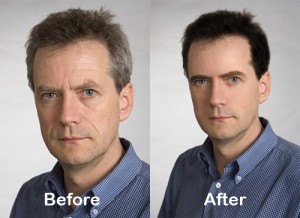
So what’s my point? We all know that magazine cover shots are always air brushed or digitally modified in some way (usually many ways). I even saw a magazine once that had the cover shot re-printed in the table of contents area, only someone forgot to put the updated/airbrushed version in there. It was totally crazy to see the difference between the original shot in the table of contents vs the airbrushed shot on the cover. I mean, usually people think of airbrushing as little touch-ups, maybe removing a spot or trimming a tummy bulge or something… but what I saw on that magazine cover was just about as drastic as this image I dug up out of google images:
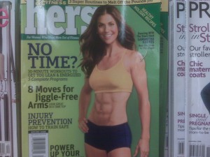
So yes, I’ve seen some pretty bad magazine covers in my day… but this one takes the cake. I was walking around Safeway last night trying to find ziplock freezer bags and walked by the magazine stand. This cover was so bad it caught my eye through only my peripheral vision! My brain told me to stop in my tracks and recheck what I thought I saw. This is what turned out to be so important that my head wanted a second look:
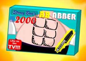
I know body builders usually use fake tan to add sheen and definition, but this looks (pardon the pun) ABsolutely ridiculous. It looks like she (or the post shoot editor) did one of these moves:
 |
 |
This seems to coincide with the theory Jennifer has that, in the wash of high gloss, even toned, “perfect people” waiting to greet you when you pass by the magazine rack, some mags are trying to stand out now by purposely putting “off” cover art up on the rack… be it an odd position, a funny look, badly done makeup, or drawn-on abs. After seeing this, I think she might be right.
Tags: photography





That picture is still so crazy ridiculous! Haha – and I love the Strong Bad abs.
I’ve seen countless magazine covers this year that are just so shockingly bad that there is no way the celebrity’s publicist would have allowed it had they not been in on it… it has to be that it catches your eye and intrigues you… what would be a quick glance at the latest Elle Magazine, turns into a 3 minute scrutinizing session… you want to buy copies of it to show all your friends! Haha 🙂
[…] Amal Graafstra An object at rest cannot be stopped! « When irregular is more captivating than “perfect” […]
[…] came across this picture of a simply horrible ad. My hunch, which I’ve talked about before (here, and here), is that they purposely picked this ridiculous picture to capture my attention (which it […]